
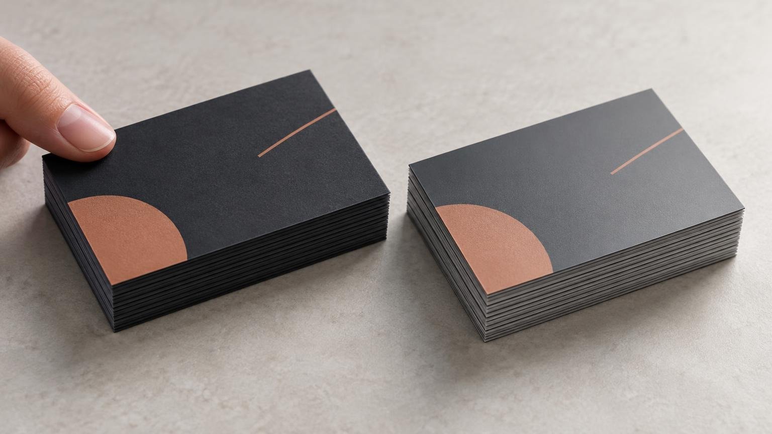
TLDR: In a soft touch vs matte lamination decision, choose soft touch when tactile impact is central to the design. Choose conventional matte lamination when you primarily want subdued reflection and a visually restrained surface. Neither name guarantees better scuff resistance, fingerprint control, writability, color reproduction, or durability. Those results depend on the particular film, base stock, printed image, application process, and handling conditions.
The difficult part is that printers do not use “matte” consistently. It can describe a paper or cardstock, a liquid coating, a laminating film, or simply a low-glare appearance. Soft touch is usually a tactile matte film or coating marketed with terms such as velvet or suede, but those labels do not identify one standardized construction. This is therefore a research-based finish comparison, not a matched hands-on test of two samples.
Soft touch vs matte lamination starts with the construction
Lamination adds a separate film or foil layer to a printed surface. The Holmen Graphics Handbook describes lamination as an added finishing layer used for creative and practical purposes. That distinguishes true film lamination from a stock that merely has a matte surface or a liquid coating applied by the printer.
Before comparing quotes, determine which of these products each supplier is actually offering:
- Matte paper or cardstock: the low-glare quality comes from the stock or its manufactured surface treatment, without necessarily adding a laminating film.
- Matte coating: a liquid coating, such as an aqueous or other press-applied finish, creates a subdued surface but may not provide the same construction as film.
- Matte film lamination: a separate low-glare film is bonded over the printed sheet.
- Soft-touch film or coating: a matte-looking surface engineered to produce a more pronounced tactile effect, commonly described as velvety, rubberized, suede-like, or soft.
- Silk or satin lamination: a related but distinct finish category that usually sits between very flat matte and glossy surfaces in visual character. It should not automatically be treated as equivalent to soft touch.
The distinction is not academic. UPrinting’s standard business-card configurator, for example, separates 14 pt and 16 pt matte cardstock from laminated choices such as 16 pt Soft Touch and 16 pt Silk. In that product pathway, selecting “matte” does not necessarily mean selecting matte film lamination.
MOO likewise describes Matte as smooth and shine-free while describing Soft Touch as velvety and tactile, but the options appear through different business-card product pathways. That makes the descriptions useful examples of market terminology, not a controlled finish-only comparison on an otherwise identical card.
What changes for the buyer?
| Decision factor | Soft touch | Matte lamination | What to verify |
|---|---|---|---|
| Surface feel | Designed to provide a noticeable tactile effect | Usually selected for a smooth, subdued surface rather than pronounced softness | Obtain physical samples from the exact product line |
| Glare | Generally low-glare or matte-looking | Generally low-glare, although sheen varies by film | View samples under office, retail, and directional lighting |
| Visual character | Can make the piece feel more sensory or deliberately finished | Often gives a quieter, more neutral presentation | Test photographs, gradients, fine type, and brand colors |
| Thickness and stiffness | A film construction adds material to the printed sheet | A film construction also adds material; matte stock alone may not | Ask for base-stock caliper, film thickness, treated sides, and finished caliper |
| Scuffs and fingerprints | Performance depends on the specific product and artwork | Performance also varies by film formulation and handling | Request supplier data and perform a handling test |
| Writing | May be difficult with some pens or markers | May also resist or alter writing behavior | Test the intended pen on the finished surface |
| Foil or Spot UV | May be available as part of a specialized production workflow | May be available, but not on every film or product line | Get written confirmation for the exact embellishment and artwork |
| Cost | Often positioned as a tactile premium upgrade | May be less expensive, but pricing depends on product construction | Compare matched size, quantity, stock, sides, turnaround, and shipping |
Soft touch is primarily a tactile choice
Soft touch earns its place when the physical interaction is part of the message. A business card, presentation folder, luxury package, invitation, or short brochure may spend enough time in someone’s hands for the surface feel to register. MOO’s descriptions illustrate this positioning: its Soft Touch option is presented around a velvety tactile quality, while Matte is described around smoothness and lack of shine.
That does not make soft touch universally more premium. A pronounced tactile surface can be unnecessary on disposable handouts, information-heavy inserts, internal documents, or materials purchased primarily for economical distribution. If recipients barely handle the item, paying for a sensory effect may not change the practical result.
Names such as soft touch, velvet, and suede also overlap without proving identical materials. Buyers comparing those labels should check the film or coating, base stock, treated sides, and total construction rather than assuming the words are interchangeable. The related soft-touch versus velvet lamination guide examines that naming problem in more detail.
Matte lamination is usually the more neutral visual choice
Conventional matte lamination is appropriate when the priority is reduced reflection and a restrained surface rather than an obvious tactile statement. That can suit text-heavy brochures, menus, presentation covers, understated stationery, and designs where the finish should remain in the background.
Even here, “matte” is not a sufficient specification. Different overlaminating films can have different thicknesses and functional properties. D&K documentation, for example, lists matte overlaminating films with variations that include scuff-resistant and UV-inhibiting products. Those are product-specific properties, not benefits that can be assigned to every matte laminate.
Do not confuse reduced glare with automatic durability. A matte surface may hide certain reflections while still showing rub marks, oils, scratches, or polishing in frequently touched areas. Conversely, one supplier’s soft-touch film may include a stated resistance property that another supplier’s product does not.
Neither finish name establishes wear performance
A Drytac technical sheet identifies one MHL Soft Velvet Touch product as a 1.4 mil, or 35 micrometre, nylon thermal laminating film with a velvet-matte finish and stated scuff resistance. That is useful evidence about the identified Drytac film only. It does not establish that every printer uses that film or that all soft-touch products share its thickness and properties. Review the identified film specification when you need an example of the detail a meaningful product sheet can provide.
The same evidentiary limit applies to matte products. Film formulation, adhesive, application, cure or bonding conditions, ink coverage, base stock, storage, shipping, and handling can all affect the delivered piece. Without matched samples and a repeatable test, there is no responsible universal winner for scratches, fingerprints, corner wear, rub marks, or long-term surface change.
Dark full-bleed artwork deserves particular scrutiny because marks and tonal changes may be more conspicuous than on pale or unprinted areas. That is a reason to test the artwork, not proof that one finish category will always fail. Ask for a production sample or short proof using the intended design rather than relying on an unprinted finish swatch.
Choose by use case, not by the word “premium”
For a tactile brand impression
Start with soft touch when the object is meant to be held and the tactile effect supports the brand. Good candidates include premium business cards, presentation folders, packaging sleeves, invitations, and small-run leave-behinds. The upgrade is easier to justify when touch is part of the intended experience rather than a feature hidden in an online specification.
For a quiet, low-glare presentation
Start with matte lamination when you want subdued reflection without making texture the central feature. It is often the cleaner default for information-led materials. Confirm that the quote is for a matte film rather than matte cardstock or a liquid coating if lamination itself matters to the job.
For high-handling pieces
Do not choose from the category name alone. Ask for the actual film manufacturer and product, any supplier-stated resistance properties, cleaning or handling guidance, and a finished sample. If the piece will be passed around repeatedly, placed in bags, mailed without protection, or used as a menu or reference card, run a handling test that resembles the real application.
For cards that must accept handwriting
Treat writability as a required production test. Pens, permanent markers, gel inks, and stamps behave differently across films and coatings. Drying time, smearing, skipping, and adhesion can matter more than whether the surface is called matte. If only one section needs writing, ask whether that area can be left unlaminated or produced with a finish intended for variable information.
For foil, Spot UV, or other embellishments
Compatibility depends on the printer’s production system, film, adhesive, embellishment process, and sequencing. A provider offering both features separately has not necessarily approved them in combination. Obtain confirmation for the exact configuration and ask whether fine lines, reverses, registration tolerances, or minimum feature sizes affect the artwork. The comparison of Spot UV, foil, and raised foil explains what those embellishments contribute beyond the base laminate.
When comparing specialty-finish vendors or broader online printing options, normalize the entire product rather than matching two listings that happen to use the word “matte.” The underlying stock, number of laminated sides, film, embellishments, quantity, proof method, and turnaround should be equivalent before price differences mean much.
A practical pre-order test
A generic sample book is useful for narrowing options, but it cannot show exactly how your artwork will interact with a finish. Use this workflow before committing to a large or brand-critical order:
- Request samples from the exact product line. Confirm that they use the current film, stock, and production process quoted for your job.
- Write down the complete construction: base stock, printed sides, laminate or coating type, treated sides, film thickness if available, and finished caliper.
- Inspect the samples under several light sources. Look at glare, fine text, dark solids, skin tones, gradients, and small reversed elements.
- Handle the pieces as recipients will. Stack them, slide them against one another, place them in a wallet or folder, and check areas that receive repeated finger contact.
- Test every pen, stamp, label, adhesive, or packaging process that will touch the finished surface. Allow realistic drying and curing time.
- Approve a proof or short production run using the actual artwork when color, dark coverage, embellishment registration, or surface wear could materially affect the result.
Questions to ask before approving the quote
- Does “matte” mean cardstock, a liquid coating, or film lamination?
- Is the soft-touch option a film or coating, and does the supplier identify the product used?
- Are one or both sides treated?
- What are the base-stock and finished calipers?
- Does the supplier state any scuff, scratch, UV, or chemical-resistance properties for this exact construction?
- Can the finished surface be written on with the intended instrument?
- Are foil, Spot UV, folding, scoring, gluing, or other finishing operations approved for the selected laminate?
- Will lamination occur before or after trimming, folding, or embellishment?
- Can the printer provide a current sample or a proof made with the same production route?
- Does the quote use regular or promotional pricing, and does it include setup, proofing, production, shipping, and any rush charge?
If specialty effects are still under consideration, the guide to business-card printers offering specialty finishes can help identify the capabilities worth comparing. Recheck every current configuration before ordering because product availability, pricing, and compatibility can change.
The verdict
Soft touch is the better starting point when tactile character is a deliberate part of the design. Matte lamination is the better starting point when you want a restrained, low-glare film without paying primarily for a velvety sensation. Neither is automatically the more durable, writable, fingerprint-resistant, or color-accurate option.
Your next step should be to replace the marketing label with a construction specification. Confirm whether the product is stock, coating, or film; identify the treated sides and finished thickness; verify embellishment and writing requirements; and test the actual artwork. That process will tell you more than “soft touch” or “matte” ever can on its own.
References
- Graphics Handbook | Holmen
- Standard Business Cards – Premium 2×3.5 Size | UPrinting
- MOO Business Cards – Design & Print Double-Sided Business Cards
- Soft-Touch vs Velvet Lamination on Business Cards: What Actually Changes? – The Print Reviewer
- Pressure Sensitive Overlaminates
- www.drytac.com