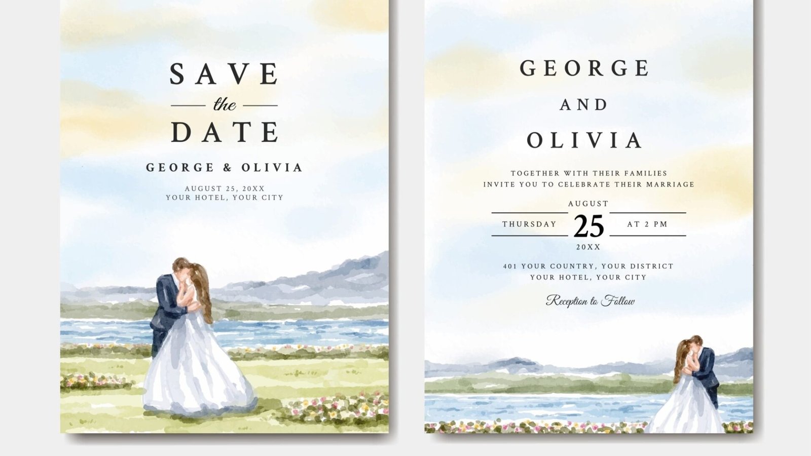
Couples often overestimate how much guests analyze invitation details and underestimate how much guests notice basic competence. Your average guest is not sitting at the kitchen table whispering, “Interesting. A smooth stock. Subtle color build. Ambitious.” They are looking for a much simpler answer: Who is getting married, when is it, where am I going, what kind of event is this, and does this feel put together?
That is good news. It means a strong invitation does not need to impress through excess. It needs to communicate clearly, feel appropriate to the event, and show enough care that people trust the details. Brides’ wedding invitation wording guidance and recent invitation-suite guidance both emphasize the essentials: hosts, couple’s names, date, time, location, and supporting information where appropriate. The Knot likewise notes that wording signals formality, while extra information belongs on enclosure materials rather than crowding the main invitation.
The first thing guests notice is whether they can understand it
This sounds obvious, which is exactly why people mess it up.
If the names are hard to parse, the font is too ornate, the contrast is weak, or the layout feels cramped, guests notice that immediately. They may not say, “The typographic hierarchy is collapsing,” because most decent people do not talk that way at breakfast. But they do feel the friction. Readability matters more than many couples want to admit.
That applies to envelope addressing too. Martha Stewart’s guidance on wedding invitation addressing still emphasizes full guest names and appropriate titles, even though etiquette has loosened in some areas. Brides’ recent guidance on handwritten invitations also stresses using enough contrast for easy readability. So yes, script can be lovely. But if people need to tilt the card toward a window and squint, that is not romance. That is a usability issue.
If guests struggle to read the invitation, they do not think, “How artistic.” They think, “I hope I got the start time right.”
The second thing they notice is tone
Guests may not remember every line of wording, but they absolutely pick up the tone.
A formal invitation reads differently from a relaxed one. Traditional wording, full names, spelled-out dates, and restrained layout signal something different than playful copy, modern fonts, or a photo-forward design. The Knot’s wording guidance explicitly notes that invitation wording reflects the level of formality, which tracks with what people actually experience. Before guests arrive at the ceremony, the invitation is one of the first signals telling them what kind of event this is likely to be.
This is why mismatches stand out. A very formal black-tie wedding with a casual, jokey invitation feels off. A backyard wedding with extremely stiff wording can feel oddly ceremonial in the wrong direction. Guests notice when the paper, wording, and design all seem to be describing the same event. And they notice when they are not.
That does not mean there is one right style. It means coherence matters.
Yes, people notice paper and print quality
They may not know exactly what they are noticing, but they notice it.
A well-printed invitation feels crisp. The text looks clean. Colors look deliberate rather than muddy. The piece has some presence when someone holds it. Brides’ reporting on printing invitation files includes a stationer recommending a minimum of 17-point cardstock for a nicer feel, while Paper Source describes heavier paper as more luxurious and publishes invitation products on 130# cover stock. Those are industry-facing ways of saying something ordinary people understand immediately: thin paper feels cheap, and substantial paper feels more considered.
The same goes for print clarity. PrintInvitations says it uses HP Indigo printing because invitation designs often rely on subtle color, fine typography, and delicate artwork. Guests do not need to know the print method to register the outcome. They simply notice whether the card looks sharp, smooth, and intentional. That is one reason I would rather see a simple design printed well than a very ambitious design printed badly.
What guests usually do not notice as much as couples think
They usually do not notice whether you debated three ivory shades for ten days.
They do not usually notice that the insert card is two millimeters narrower than another one unless the suite looks sloppy.
They often do not know whether the invitation was digitally printed, letterpress printed, or printed by an online service unless the result is visibly poor or strikingly tactile.
And most guests do not need a miniature stationery museum in the envelope. In fact, overloading the suite can work against you. Brides and The Knot both recommend keeping the main invitation focused on essential information and using a details card or website for overflow information. That is not just etiquette. It is good communication.
The point of an invitation is not to prove how many components you could fit into an envelope. It is to help guests understand the event and feel warmly welcomed into it.
The mistakes guests notice fastest
The fastest way to make an invitation feel less polished is not cheap paper. It is a preventable error.
Guests notice misspelled names. They notice when the weekday does not match the date. They notice when the ceremony and reception information are vague, conflicting, or missing. They notice if the dress code is unclear but obviously important. They notice if the RSVP path is confusing. Brides’ common invitation-mistakes guidance calls out exactly these issues: unclear timing, incomplete information, missing RSVP instructions, and confusion about who is invited.
And guests absolutely notice when they are not sure whether their children are invited or whether they have a plus-one. Envelope addressing is often where that clarity lives. If you want people to know who is invited, tell them clearly. Wedding etiquette is much easier when it is not relying on telepathy.
What creates the best impression in real life
The best wedding invitations usually get a few things right all at once.
They are readable.
They match the tone of the event.
They include the right information and put extra information in the right place.
They feel good in hand.
And they have clearly been proofed.
That last point matters more than people think. PrintInvitations currently includes free digital proofs with every order and offers physical proofs or samples for a fee. That matters because proofing is how you catch the small errors that guests absolutely do notice. It is also how you make sure the design still works once your actual names, venue, time, and wording are on the page. Services like Print Invitations are most useful not because guests know the brand name, but because a proofed, well-printed invitation tends to feel calmer and more finished when it lands in the mailbox.
A practical standard to aim for
If you want guests to have a good impression of your invitation, aim for this:
They should be able to understand the event in seconds.
They should feel the tone of the wedding without having to decode it.
They should not have questions that the invitation could have answered.
And the piece should feel like someone cared.
That is the whole game. Not extravagance. Not stationery theatrics. Just clarity, tone, and care.
A simple invitation can do that beautifully. A formal invitation can do that beautifully. A modern invitation can do that beautifully. The design style is flexible. The underlying job is not.
FAQs
Do guests care about expensive printing methods?
Usually less than couples think. Guests tend to notice the result more than the method: readability, paper feel, clarity, and tone.
What matters more, design or wording?
Both matter, but clarity comes first. If people cannot quickly understand the names, date, location, and tone, the design is not doing its job.
Do guests notice paper quality?
Yes, especially in a broad sense. They may not know the stock by name, but they can usually tell whether a piece feels thin, sturdy, polished, or flimsy.
Should everything go on the main invitation card?
Usually no. Essential information belongs on the main invite, and overflow details are often better on a details card or wedding website.