If you want the shortest version of DPI vs PPI explained, it is this:
PPI describes the pixel density of the digital image.
DPI describes the dot density of the printed output.
When print shops say “300 DPI file,” they often mean a file that is about 300 PPI at final size.
That last part is where most confusion lives.
What PPI Actually Means
PPI means pixels per inch.
It refers to how many pixels are packed into each inch of a digital image at a given size. Higher PPI generally means more image detail. Lower PPI means bigger pixels and a blockier result when the image is printed large.
The key thing is that PPI is about the image itself.
If you have an image that is 3000 pixels wide and you print it 10 inches wide, that is 300 PPI.
If you print that same 3000-pixel image 20 inches wide, it becomes 150 PPI.
Same file. Different print size. Different result.
That is why image resolution is never just a number floating in space. It is always tied to output size.
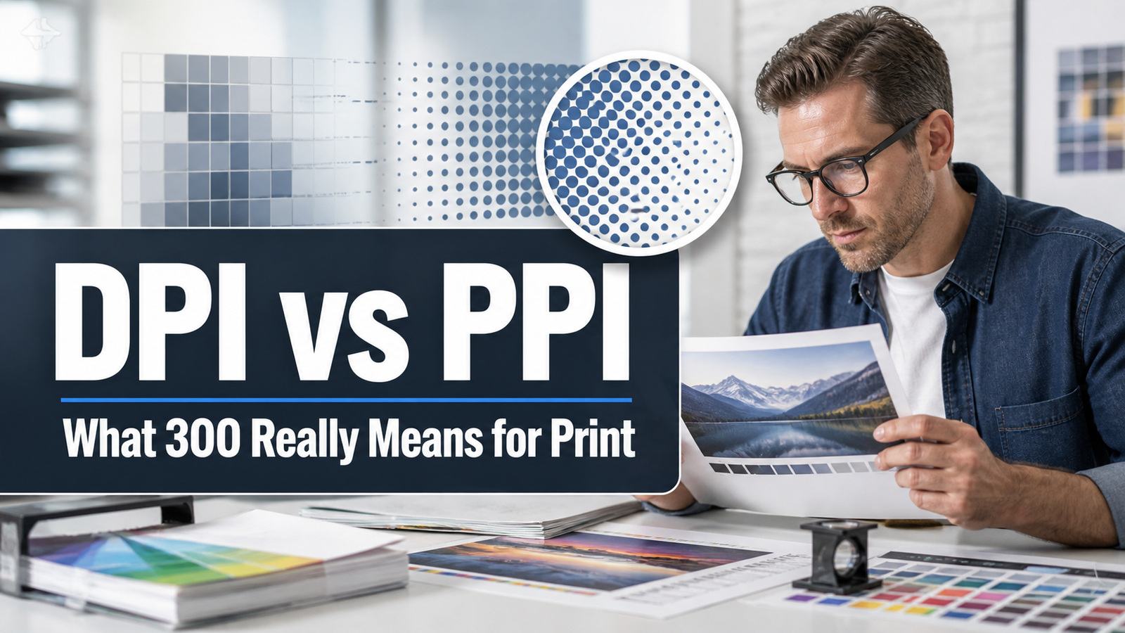
What DPI Actually Means
DPI means dots per inch.
This is a print-output term. It refers to the physical dots a printer places on the material. Those dots are not the same thing as the image pixels in your file, even though people casually treat them like twins.
They are more like coworkers with overlapping responsibilities.
In practice, designers and buyers often say DPI when they really mean PPI. That is common. It is also why the phrase “300 DPI” gets used as shorthand for “high enough resolution for normal print.”
The shorthand is understandable. It is just not technically tidy.
Why 300 Keeps Showing Up Everywhere
Because 300 PPI at final size is a very common standard for high-quality, close-viewed print.
That is why DPI vs PPI explained almost always ends up circling back to 300. It is the familiar target for business cards, brochures, invitations, postcards, and many other small-format printed pieces that people hold in their hands and inspect up close.
But 300 is not a magic law for every situation.
Large-format prints can often use lower effective resolution because they are viewed from farther away. A billboard is not judged from eight inches away by a suspicious person holding coffee. Different viewing distances change what is actually necessary.
So the smarter rule is not “everything must be 300.” The smarter rule is “resolution should match the viewing distance and the product.”
Why 72 PPI Keeps Confusing People
Because old web guidance never really died. It just became folklore.
You still hear people say things like “screen is 72 DPI” or “just change it to 300 DPI and it will print fine.” Those phrases are usually oversimplified, and sometimes just wrong in practice.
Changing the metadata number alone does not create new image detail. What matters is how many actual pixels the file has relative to the size you want to print.
A tiny web image does not become print-ready just because you type a nicer resolution number into a box. That is not file repair. That is optimism.
Actual PPI vs Effective PPI
This is one of the few technical distinctions that is genuinely useful.
Actual PPI is the resolution of the image at its original size.
Effective PPI is the resolution after you scale the image in your layout.
If you enlarge a raster image in InDesign, the effective PPI drops.
If you shrink it, the effective PPI rises.
That means a file that looked fine at one size can become borderline the moment you scale it up in the layout. This is why checking the placed size matters more than staring at the raw number attached to the original file.
In other words, the layout gets a vote.
A Quick Example
Let’s say you place a 300 PPI image at 100% size. Fine.
Now enlarge it to 200% in layout.
Your effective PPI drops to 150.
Shrink that same image to 50%.
Your effective PPI jumps to 600.
The image file itself did not magically gain or lose pixels. What changed was the size you asked those pixels to cover.
That is the easiest way to understand why DPI vs PPI explained really becomes a sizing question, not just a terminology question.
What Resolution Is Usually Good Enough
For normal commercial print, 300 PPI at final size is a very common target for raster images.
That is the practical baseline for many close-viewed printed pieces.
For large format, lower can still work well depending on how far away the viewer will stand. That is why posters, banners, and billboards do not always need the same pixel density as small hand-held print.
For line art, tiny text inside raster graphics, or one-bit bitmap artwork, the needs can be different. Hard edges tend to show softness sooner than photos do. This is one reason logos and clean type are better kept as vector whenever possible.
The Mistakes People Make Most Often
One mistake is using DPI and PPI interchangeably without understanding that one refers to the file and one refers to print output.
Another is assuming that changing the resolution setting without changing pixel dimensions creates detail. It does not.
Another is checking only the original image resolution and ignoring the scaled size in layout.
And another is using low-resolution web graphics for print because they looked surprisingly okay on screen.
Screens are forgiving. Print is not nearly as polite.
The Simple Rule That Usually Helps
If the image is raster, check its effective PPI at final print size.
If the job is normal close-viewed print, 300 PPI is a solid target.
If the job is large format, ask what viewing distance really requires.
If the art contains logos or small type, keep those elements vector if you can.
That rule is not glamorous, but it keeps a lot of preventable blur out of finished work.
Final Verdict
DPI vs PPI explained comes down to one useful distinction.
PPI is about the digital image.
DPI is about the printed output.
In real-world print conversations, people blur the terms constantly. That is normal. But when you are checking whether a file is truly print-ready, what usually matters most is the image’s effective PPI at the size it will actually print.
That is the number worth respecting.
And no, changing 72 to 300 in a dialog box does not summon missing detail out of thin air. If it did, a lot of prepress people would be noticeably less tired.