Printers (and product pages) throw around terms like spot UV, spot gloss, spot varnish, raised spot UV, 3D, embossed gloss, and raised print like we all meet weekly to standardize jargon.
So here’s the clean version: Spot UV vs Raised UV is mostly about thickness and feel.
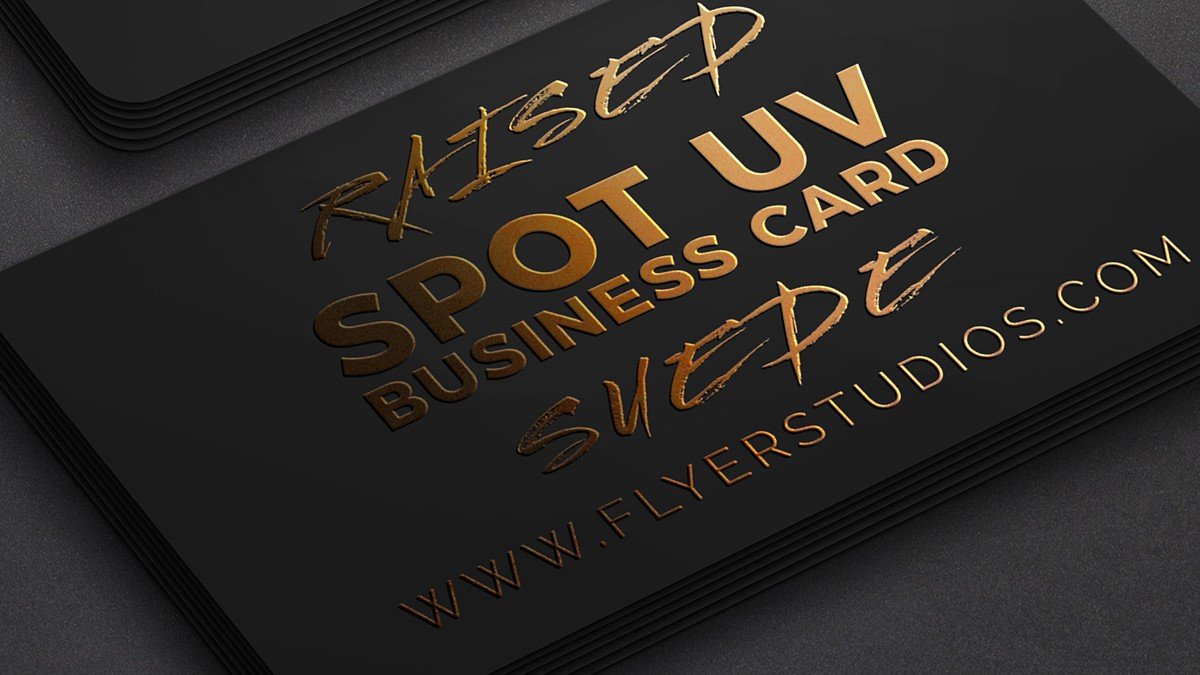
What Spot UV actually is
Spot UV is a clear UV-cured varnish applied to specific parts of a printed piece (your logo, a pattern, a headline) instead of coating the whole surface. It’s used to create contrast: glossy areas against a matte or soft-touch background, or glossy-on-glossy if you really want to play life on hard mode.
How it’s commonly applied: a separate “mask” (plate/screen or digital layer) tells the press where to lay down varnish, then UV light cures it quickly.
Two useful notes:
- Spot UV can be “blind” (applied where there is no ink underneath). It only shows when it catches the light.
- The effect is usually more sleek than tactile. You’ll feel a tiny difference, but it’s mostly a visual punch.
What Raised UV is (and why your fingers notice first)
Raised UV (often called raised spot UV or 3D spot UV) is still a clear UV coating. The difference is that it’s deposited thicker, so it creates a noticeable raised texture.
This is why it gets described as “embossed” in marketing. It’s not traditional embossing with a metal die. It’s more like a controlled, glossy “build” on top of the print.
Depending on the equipment and process, raised effects can range from lightly dimensional to very noticeable. Some shops specify raised UV thickness in microns, and digital embellishment systems can vary coating thickness dramatically.
Spot UV vs Raised UV: the quick comparison
Here’s the practical difference when you’re holding the card:
- Look
- Spot UV: glossy highlight, mostly flat
- Raised UV: glossy highlight with visible depth
- Feel
- Spot UV: smooth with slight change
- Raised UV: tactile, you can feel edges and shapes
- Best use
- Spot UV: clean accents, subtle patterns, modern minimal designs
- Raised UV: bold logos, thick typography, simple icons, “touch me” moments
- Risk level
- Spot UV: can look “meh” if there’s no contrast
- Raised UV: can look cheap fast if overused, misaligned, or applied to tiny fussy details
What looks cheap fast (and how to avoid it)
This is the part nobody wants to learn after ordering 500 cards.
Using too much UV like it’s a full laminate
When the UV layer covers most of the front, it stops feeling intentional and starts feeling like someone spilled clear coat and called it “premium.”
Rule of thumb: pick one hero element (logo, name, pattern band). Let the background stay calm.
Trying to align UV to microscopic details
Spot UV is applied in a separate pass. That means registration tolerance is a real thing, not a myth printers tell designers to ruin their fun.
If your UV layer is supposed to perfectly trace hairline strokes, tiny counters, or small outlined text, you’re basically designing for disappointment. Misregistration can create a “halo” or offset shine that reads as sloppy, even if the print is technically within tolerance.
Small glossy text that becomes hard to read
Gloss is reflective. Reflective text gets glare. Glare makes people tilt the card like they’re trying to unlock Face ID.
If you’re putting Spot UV or Raised UV on text, keep it large and simple. Thin scripts in glossy coatings are where elegance goes to die.
Putting UV too close to the edge
Edges get handled, bumped, and cut. UV at the trim can chip, flake, or peel, especially on thick “built” effects.
Keep your UV elements safely inset. If the design needs an edge treatment, use something that’s meant to live there (like colored edges or a border that’s printed, not coated).
Expecting mirror-gloss on absorbent, unsealed paper
Uncoated, textured, or absorbent stocks can make Spot UV look dull or patchy instead of crisp and glassy. If you want that clean contrast, a sealed surface (matte laminate, soft-touch laminate, aqueous coat, etc.) usually behaves better.
Trying gradients, fades, or “50% UV”
Many printers want Spot UV supplied as a solid, defined shape (basically on/off). Fine fades and tints are often not supported or don’t reproduce predictably. If you want a gradient-like effect, do it with the printed artwork, not the UV layer.
How to make either finish look intentional
If you only take one thing from this article, take this: UV finishes look expensive when they’re treated like design, not decoration.
Design moves that almost always work
- Matte or soft-touch base + UV accents. Contrast is the whole point.
- One big simple shape beats ten tiny ones.
- Use UV to guide the eye. Logo mark, name, or one pattern strip. Not everything, everywhere, all at once.
- Build in tolerance. Don’t expect perfect alignment to micro-detail.
File prep basics (so your printer doesn’t hate you)
Most printers will want:
- A separate Spot UV layer (or separate file) showing where UV goes
- Vector shapes (not fuzzy raster masks)
- Text converted to outlines
- Clear naming (like “SPOT_UV” or “RAISED_UV” layer)
And yes, each vendor has their own preferences. Annoying, but survivable.
When to choose Spot UV
Pick Spot UV if:
- You want a clean, modern upgrade without turning the card into a texture demo
- Your design has fine detail you want to highlight (but not trace perfectly)
- You want the effect to be more “caught in the light” than “felt like braille”
- You care about cost and want a premium touch without going full boutique
Spot UV vs Raised UV is not a moral choice. Spot UV is just the quieter friend who still dresses well.
When to choose Raised UV
Pick Raised UV if:
- Your brand benefits from tactile impact (luxury, beauty, design, high-end service)
- Your logo and typography are bold enough to handle the “build”
- You want people to instinctively run their thumb over the card (in a normal way, not a weird way)
Raised UV works best when it’s simple and confident. It looks worst when it tries to do lacework.
Final verdict
If you’re deciding between Spot UV vs Raised UV, ask yourself one question: do you want people to see the finish, or feel it?
- Spot UV is the polished highlight. It can look very premium when paired with matte or soft-touch.
- Raised UV is the tactile flex. It can look incredible, but it punishes fussy designs, edge-to-edge coverage, and tiny detail.
Use UV like seasoning, not like frosting.