Here’s the honest take: thickness matters, but it’s not the only thing that changes how a card feels.
What “pt” actually means (and why it’s confusing)
In business card land, pt usually means “points,” and one point is 0.001 inches of thickness. So:
- 14pt ≈ 0.014 inches
- 16pt ≈ 0.016 inches
- 32pt ≈ 0.032 inches
That’s why the jump from 14pt to 16pt is real but subtle, while 32pt is a totally different experience.
Quick reality check: paper “weight” (like 100lb cover) and paper “thickness” (pt) aren’t the same thing. Two papers can weigh the same and still feel different if one is denser or coated differently. So if a printer only talks in “lb” or “gsm,” ask for the point thickness too.
14pt business cards: the standard for a reason
14pt is the “normal” business card thickness you’ll get from a lot of online printers by default. It’s popular because it balances cost, stiffness, and compatibility with common finishes.
When 14pt makes sense:
- You need a lot of cards and cost matters.
- You’re putting cards into mailers, giveaway packs, or leaving stacks at counters.
- Your design is simple and you don’t need the card itself to do the talking.
The downside: 14pt can feel a bit ordinary. It’s also more likely to show corner dings and light bending over time, especially if you’re the type to keep cards loose in a pocket.
16pt business cards: the small upgrade most people notice
If you want a card that feels “a little nicer” without going full luxury, 16pt is the move. It’s only 2 points thicker, but in-hand it usually feels stiffer and less prone to bending.
When 16pt makes sense:
- You hand cards out in person and want a slightly more premium feel.
- You don’t want to baby your cards (pockets happen).
- You want a nicer default without jumping into specialty stocks.
This is also the thickness range where coatings and laminations can really change the feel. A 16pt card with a good matte or soft-touch finish often feels more expensive than it actually is.
32pt business cards: ultra thick, often layered, and not subtle
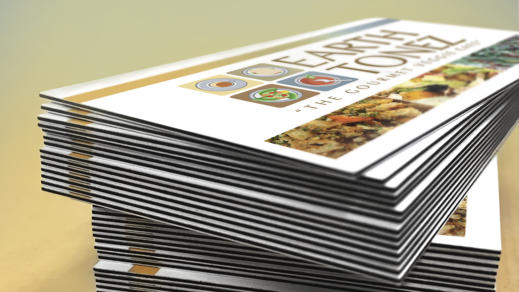
32pt is “wow, that’s a card” territory. A lot of 32pt business cards are made by bonding layers together (sometimes with a colored seam or core), which is why they feel more rigid and substantial than standard stock.
When 32pt makes sense:
- You’re in a high-touch business (real estate, luxury services, premium products).
- You give out fewer cards, but each one needs to land hard.
- You want edge details like painted edges or a colored core to be part of the design.
The tradeoffs:
- Thicker cards can feel awkward in some wallets and card holders.
- They usually cost more, and options can be more limited depending on the printer.
- Certain finishes, foils, and production methods may have restrictions on ultra thick stock.
If you’re considering 32pt, it’s worth ordering a small batch first. Some people love the feel. Others think it’s “too much” for their audience.
Quick comparison table
| Thickness | Feels like | Best for | Watch outs |
|---|---|---|---|
| 14pt | standard | bulk, everyday networking | more bend, more wear |
| 16pt | premium standard | most pros, better durability | small price bump |
| 32pt | ultra rigid | high impact, luxury, special finishes | wallet fit, higher cost |
Thickness isn’t everything: finish and paper type can matter more
This is where people get tricked. A 14pt card with a great finish can feel better than a 16pt card with a cheap coating.
A few common feel changers:
- Gloss UV: slick, vibrant, fingerprints show more.
- Matte: smoother, less glare, usually feels more “modern.”
- Soft touch laminate: velvety feel, looks premium, can scuff if abused.
- Uncoated: textured, writable, more “natural” and less flashy.
So when you’re weighing 14pt vs 16pt vs 32pt business cards, don’t treat thickness like the only lever. Ask what coating or laminate you’re actually getting.
A practical way to choose (without overthinking it)
Here’s the simple decision logic:
Pick 14pt if:
- you’re ordering thousands
- you mainly leave cards behind or include them in packages
- you don’t need a “premium feel” signal
Pick 16pt if:
- you want the safest upgrade with the least risk
- you meet people face-to-face
- you want better durability without changing your whole vibe
Pick 32pt if:
- you’re ok with higher cost per card
- you hand cards out selectively
- you want the card itself to be part of the “brand moment”
And if you’re also choosing a printer, these two Print Reviewer comparisons can help narrow down which companies actually offer decent stock and finish options:
- PsPrint vs PrintPlace Business Cards: Which Printer Wins?
- Vistaprint vs Jukebox Print for Custom Business Card Printing
The one mistake i see all the time
People choose 32pt hoping thickness will “save” a weak design. It won’t. If the typography is cramped, the spacing is off, or the logo is low-res, a thicker card just makes the problems feel more permanent.
Start with a clean layout, readable type, and solid contrast. Then use thickness to support the message, not replace it.
Conclusion
So, 14pt vs 16pt vs 32pt business cards comes down to how you hand them out, how long you want them to survive, and whether you want “standard,” “premium,” or “statement piece.”
If you want the least regret: go 16pt with a good matte or soft-touch finish. If you need the cheapest functional option: 14pt is fine. If you want maximum impact and you’re handing them out selectively: 32pt can be incredible.

