You design something on your computer. The colors look bright, rich, and perfect. Then you get the printed piece in your hand and… it looks dull, flat, or just wrong. It feels like the printer “messed up,” but most of the time the real problem is color modes.
Screens use RGB. Printers use CMYK. They do not speak the same language. In this article, I’ll explain the difference in plain English and walk through practical steps you can take so your stickers, cards, and labels look much closer to what you see on screen.
What is RGB?
RGB stands for Red, Green, Blue. It is the color system used by screens.
- Your monitor, phone, and TV all use tiny red, green, and blue lights.
- By changing how bright each light is, the screen can create millions of colors.
- When all three are “on” at full strength, you see white.
- When all three are “off,” you see black.
Because RGB is made of light, the colors can be very bright and vibrant. Think of neon blues, glowing greens, and super hot pinks on your screen. These are easy in RGB because the screen is literally shining light at your eyes.
RGB is called an additive color model. You start with black (no light) and add light to get color and brightness.
What is CMYK?
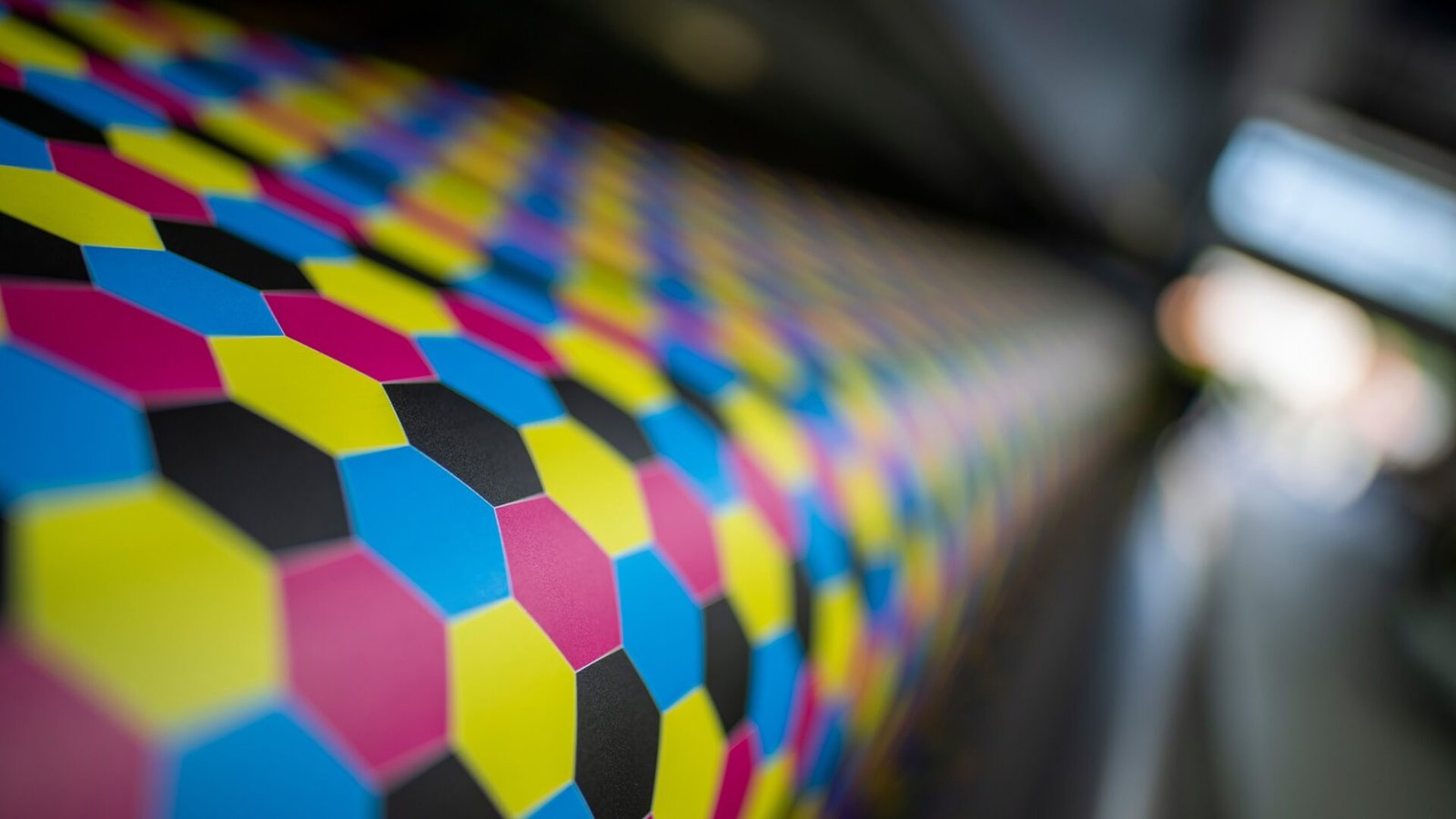
CMYK stands for Cyan, Magenta, Yellow, and Key (Black). It is the color system used in almost all full-color printing.
- Instead of light, printers use dots of ink on paper.
- Cyan, magenta, and yellow inks act like filters. They absorb some parts of white light and reflect others.
- Black ink is added to give deep shadows and save ink.
With CMYK:
- White is usually just the paper.
- The more ink you add, the darker the color gets.
- You can never be brighter than the paper itself, because there is no backlight.
CMYK is a subtractive color model. You start with white paper and subtract light by adding ink. More ink = less light bouncing back to your eyes.
The big reason colors don’t match
Here’s the core problem:
- RGB has a larger color range (gamut).
- CMYK has a smaller color range.
That means:
- There are many RGB colors that CMYK simply cannot print.
- These “out of gamut” colors show up a lot in bright blues, greens, purples, and neon-style colors.
When you send an RGB design to a printer, the printer (or your design software) has to convert those RGB colors into CMYK. Anything CMYK can’t reproduce has to be moved, or “mapped,” to the closest printable color. The result:
- Vivid screen colors become more muted in print.
- Bright blue turns into a more normal blue.
- Hot neon pink turns into a regular magenta.
Your printer did not “mess up.” The device simply cannot print light. It can only put ink on paper.
Other reasons your print looks different
The color mode is the biggest issue, but a few other things make the difference worse.
1. Your monitor is not calibrated
Most screens:
- Run at full brightness.
- Have “punchy” color settings turned on.
- Are not color-calibrated for print.
That means your screen is exaggerating everything. If you design with brightness at 100% and a super vivid profile, your print will almost always look darker and flatter.
2. You are designing in RGB for print jobs
Many common tools (PowerPoint, Word, Canva, etc.) default to RGB. If you build a flyer there and send it to be printed, you are forcing a last-minute RGB → CMYK conversion. You do not see what the colors will look like until after the fact.
3. You used “danger colors”
Some colors are famous problem children when going from RGB to CMYK:
- Neon greens and yellow-greens
- Bright turquoise / teal blues
- Electric purples and magentas
- Very bright oranges
They look amazing on a screen. In CMYK, they often look dull or shifted.
How to avoid nasty surprises
You can’t change physics, but you can plan around it. Here are practical steps you can take.
1. Choose the right color mode from the start
If your main output is print (stickers, labels, business cards, brochures):
- Set your document to CMYK before you start.
- Pick colors that exist within CMYK.
- Accept that they will look a bit “meh” on screen, but much better on paper.
If your main output is digital (web, social, screens):
- Work in RGB.
- Don’t worry about CMYK unless you know something will be printed later.
If you need both digital and print, you have two options:
- Build a print-first palette: choose colors that look good in CMYK, then make sure they are “good enough” in RGB.
- Have two palettes: one for print (CMYK) and one for digital (RGB) that are close cousins but not identical.
2. Use soft proofing in your design software
Most pro tools (Photoshop, Illustrator, InDesign, Affinity, etc.) have a feature called soft proofing or “Proof Colors.”
In simple terms, soft proofing:
- Simulates CMYK printing on your RGB screen.
- Shows you how colors will shift when converted.
Basic steps (general idea):
- Work in RGB if you need to.
- Turn on “Proof Colors” with a CMYK profile that matches your printer.
- Watch which colors lose punch or shift.
- Adjust those colors until the proofed version looks the way you want.
This is not perfect, but it is much better than guessing.
3. Avoid ultra-saturated colors in key places
You don’t have to design everything in beige. But be careful with extreme saturation in places that really matter, like:
- Logos and brand colors
- Big solid backgrounds
- Gradients in hero sections
When you pick brand colors, test them:
- Print a small sample (even on a decent desktop CMYK printer).
- See which ones survive well.
- Adjust your brand palette to live inside the “safe zone” for print.
4. Order real print samples
A real printed sample beats any on-screen preview.
If you are working with a serious printer:
- Ask for a sample pack with papers and finishes.
- Ask if they can print a small test sheet or proof of your design.
- Check how your key colors, gradients, and photos look on the actual stock.
Yes, it takes a bit more time and money up front. But it saves you from ordering thousands of dull or wrong-looking pieces.
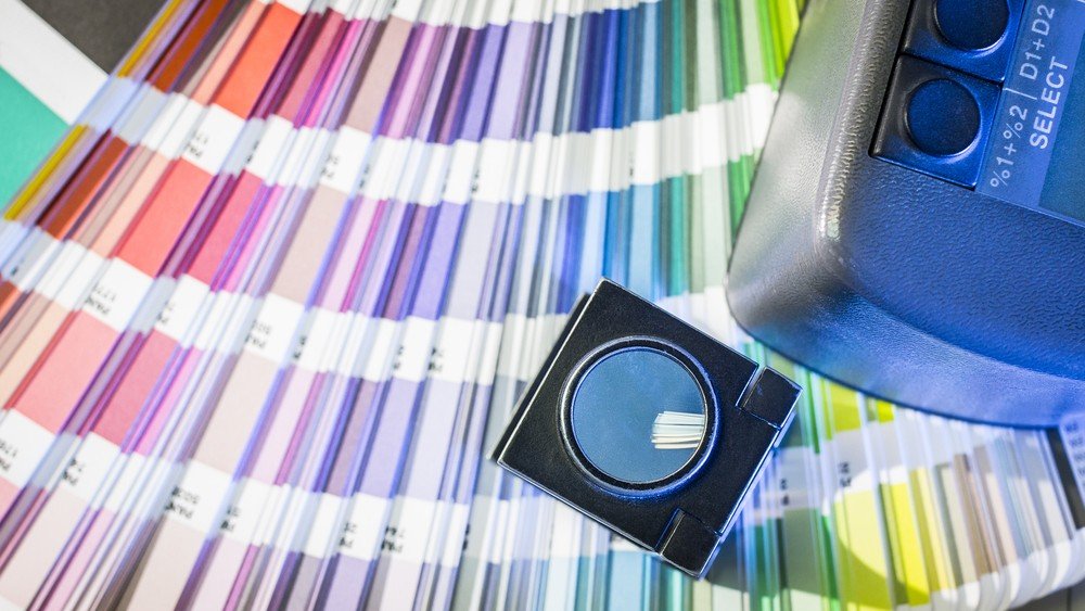
5. Use consistent profiles and printers
Every printer and paper combination behaves a little differently. Commercial printers often use specific ICC profiles to describe how their press and paper render color.
If you can:
- Ask your printer which CMYK profile they use.
- Set that profile in your design software.
- Export PDFs using that profile and their recommended settings.
This keeps everyone closer to the same “language” and reduces surprises.
Quick FAQ
Should I ever send RGB files to a printer?
In general, no. For professional work, convert to CMYK and check the result. Some digital printers will accept RGB and do their own mapping, but then you are letting the machine decide how to “fix” your colors, which can vary by device.
Why does my RGB file sometimes print “better” than my CMYK file?
On some desktop printers, the driver secretly boosts RGB colors to look more like your screen. That can look nice on one printer, but it’s not predictable or consistent across devices. A CMYK file is more honest: it shows you what the ink can really do.
Can I get neon or metallic colors in print?
Not with standard CMYK. For true neon or metallic inks, you need Pantone or other spot colors, special processes, or foil. These are usually more expensive and make the most sense on larger runs or high-end pieces.
Conclusion
RGB and CMYK are not enemies. They are tools for different jobs. RGB is bright, flexible, and perfect for screens. CMYK is grounded, physical, and limited by ink and paper.
Your prints look different from your screen because you are going from a big, glowing color space to a smaller, ink-based one. Once you accept that, you can work with it instead of fighting it: set the right color mode from the start, soft-proof your designs, stay away from “danger colors” for critical elements, and order real test prints when the stakes are high.
If you build these habits into your workflow, your stickers, labels, and printed pieces will look much closer to what you imagined—and you will stop being surprised when the box from the printer shows up.