
Choosing the right specialty sticker finish sounds simple until you actually have to place the order. Then it gets messy fast. Matte or gloss. Clear or holographic. Maybe chrome if you want something louder. And suddenly the same artwork can look clean, premium, flashy, muted, or a little hard to read. A specialty sticker finish changes more than the shine. It changes glare, color feel, readability, and how the sticker behaves on packaging, bottles, windows, and handouts.
I believe the easiest way to think about it is this: do not start with the finish name. Start with the job. Where will the sticker live? What should people notice first? Your logo, the product behind it, the rainbow effect, or the text? At some companies like CustomStickers.com or StickerApp.com, that decision gets easier because you can choose from matte, gloss, clear, holographic, and chrome-style options, then review a proof before production. That proof step matters more than people think.
Start With the Job, Not the Finish Name
The best specialty sticker finish for a trade show giveaway is not always the best one for a candle jar or storefront window. That is where people get annoyed. They choose the coolest-looking option first, then realize it fights the actual use case.
If your sticker needs to be readable at a glance, especially with small type, ingredient text, QR codes, or fine lines, start by thinking about glare. If your sticker needs to pop on a shelf or look bright in a handout stack, start by thinking about color punch. If you want the product or glass underneath to show through, start with transparency. If you want the sticker itself to feel like the event, the merch drop, or the brand personality, then special-effect finishes like holographic or chrome make more sense.
That is why the right specialty sticker finish is usually the one that supports the message instead of stealing the whole show.
Matte Vs Gloss Is the Core Specialty Sticker Finish Decision
Even when people say they want a specialty finish, matte versus gloss is still the first real fork in the road.
Matte is the safer choice when you care about readability, glare control, and a softer premium look. It works well for minimalist branding, muted color palettes, text-heavy labels, and anything that will be photographed under bright lights. If your sticker is going on packaging for skincare, candles, coffee, apparel, or boutique products, matte often feels more intentional. It does not shout. It just looks put together.
Gloss is the louder option. Colors usually feel bolder, black areas feel richer, and the surface catches light in a way that makes logos and graphic art look more energetic. If you are making event stickers, bold promo handouts, branded freebies, or colorful merch, gloss usually gives you that extra hit of contrast people notice right away.
At CustomStickers, the material guide makes this split pretty plain. Matte is framed as easier to read and more professional-looking, while gloss is described as the more fun, color-popping option. For a lot of buyers, that simple distinction is enough to get unstuck.
Here is the quick version:
| Finish | Best For | Watch Out For |
|---|---|---|
| Matte | Small text, premium packaging, photos, low-glare branding | Colors feel less punchy |
| Gloss | Bold logos, saturated art, eye-catching handouts | More reflections and glare |
| Clear | Windows, jars, bottles, minimalist packaging | Needs strong design planning |
| Holographic | Merch, promos, collectible vibes | Busy art can get harder to read |
| Chrome/Metallic | Simple logos, bold accents, statement pieces | Too much detail can get messy |
Clear Is a Specialty Sticker Finish That Rewards Restraint
Clear can look amazing. It can also go wrong in a very specific, very annoying way.
A clear specialty sticker finish works best when you want the surface underneath to become part of the design. Think glass doors, product jars, car windows, clear bottles, and packaging where you want a printed logo without a full white block behind it. The look is clean and modern. Sometimes it feels more premium because it is doing less.
But clear stickers ask more from your artwork. Anything trapped underneath the label shows. Weak contrast shows. Application mistakes show. And if you do not think through opacity, your art can look softer and less bright than it did on screen.
This is why white ink matters so much. On clear materials, a white layer under selected printed areas helps colors stay more solid and readable. Without it, the transparent material influences the whole result. CustomStickers calls this out on its clear sticker pages, and honestly, they are right to. Clear is not the finish to treat casually.
One helpful detail from CustomStickers: clear stickers usually default to a UV-resistant gloss finish, but matte can be requested. That gives you some flexibility if you want the transparency of clear without the extra shine.
My rule of thumb is simple. Use clear when the background helps the design. Skip clear when the background will compete with the design.
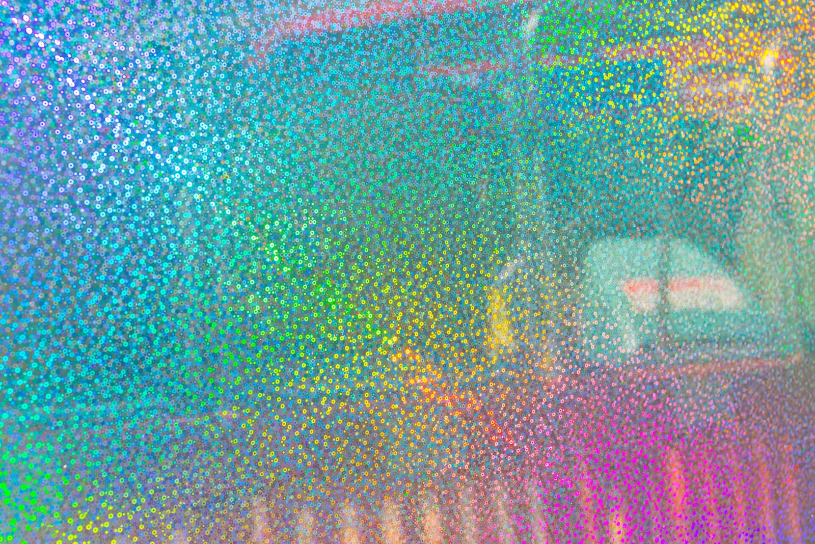
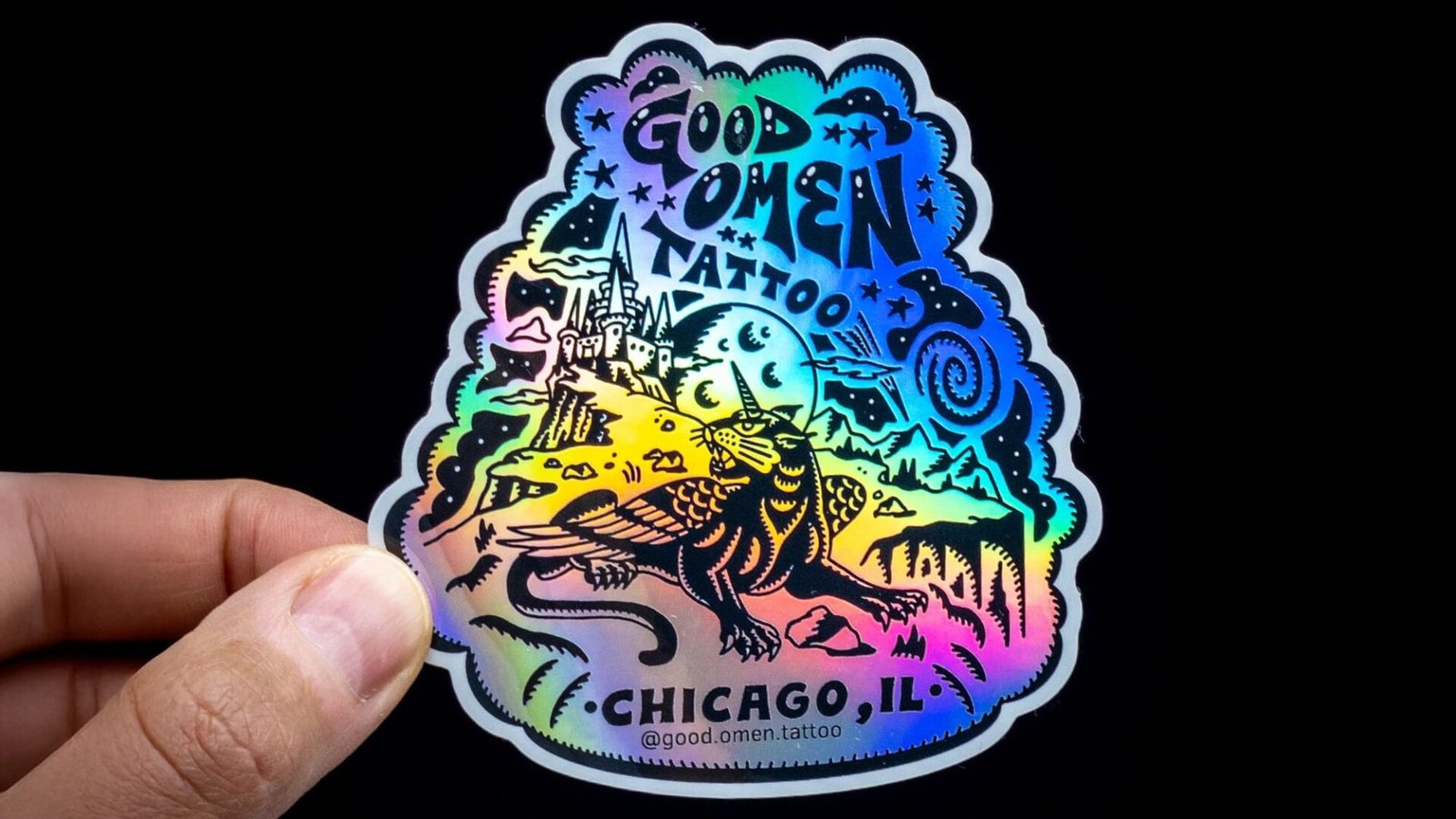
Holographic Is the Specialty Sticker Finish People Notice First
If you want attention, holographic is the obvious move. It catches light, shifts color, and makes even simple artwork feel more event-ready. For gaming brands, artists, beauty packaging, promo drops, fan merch, and giveaway stickers, holographic can do a lot of work with very little effort from the viewer. People see it. They pick it up. That part is real.
But holographic works best when the art gives the material room to breathe. That means contrast. It also means not cramming every inch with detail. On CustomStickers’ own holographic guide, they point out that dark areas can mute the effect while lighter areas reflect more light. That tracks with what most printers recommend. The shine needs room.
White ink matters here too. If you print color directly onto a holographic material, that shine comes through the ink. If you put white ink under selected areas, those parts stay more opaque and easier to read. That is how you keep a logo legible while still letting the rest of the sticker go wild. On CustomStickers, holographic stickers default to a glossy finish, which makes sense for this kind of high-impact look.
So if you want holographic, ask yourself two questions. Do I want the material to be the star? Or do I want the design to stay fully controlled with holographic only peeking through in specific areas? That answer will shape the proof.
Chrome and Metallic Finishes Work Best on Simpler Art
Chrome, metallic, and similar reflective looks are not always listed the same way across printers, but the design advice is usually the same. Keep it simple. These finishes hit hardest when you use bold shapes, strong outlines, clear typography, and enough open area for the material itself to show.
In other words, chrome is rarely the right answer for a crowded illustration with tiny color transitions and lots of text. It is much better for logos, wordmarks, icon-driven designs, badge graphics, or a single strong visual element. If you want your sticker to feel shiny, futuristic, nostalgic, or a little collectible, chrome can work really well.
CustomStickers lists chrome and metallic-style options in its finish and material guidance, which is helpful because this is exactly the type of effect that benefits from a proof and a quick conversation before printing. I would absolutely leave a note on the order if you are trying to preserve readability or want only part of the design to stay opaque.
Match the Specialty Sticker Finish to the Brand Feel
This part gets overlooked, but it matters. The right specialty sticker finish is not just about surface behavior. It is also about tone.
Matte feels calm, modern, and a little more refined. Gloss feels brighter, more promotional, and more energetic. Clear feels minimal, clean, and packaging-aware. Holographic feels playful, collectible, and attention-first. Chrome and metallic effects feel bold, graphic, and intentional when used sparingly.
If you are branding a coffee bag, candle line, wellness product, or skincare item, matte often fits the tone better than gloss. If you are making stickers for kids, creators, sports teams, gaming communities, or event swag, gloss or holographic often feels more natural. If you want a logo to sit on glass or a jar without covering the whole surface, clear is usually the right move. And if you want one graphic element to feel almost like a foil stamp, chrome is worth considering.
A lot of finish decisions are really brand decisions wearing a production hat.
How I Would Order the Right Specialty Sticker Finish at CustomStickers.com
If I were ordering from CustomStickers.com, I would keep it simple.
First, I would decide whether the sticker needs to be subtle, bold, transparent, or effect-driven. That narrows the field fast.
Second, I would choose matte or gloss if readability versus shine is the real issue. If the project needs the surface underneath to show, I would move to clear. If the goal is visual impact, I would test holographic or chrome.
Third, I would leave notes. This is a big one. If you need white ink under certain areas, if you want matte instead of gloss on a clear project, or if you are worried about small text, say that in the order notes. CustomStickers’ workflow is built around proofing, and that is the right moment to catch finish issues before they become expensive frustration.
Fourth, I would look at the proof like a picky customer, not like the designer who already knows what the art is supposed to say. Can you read it fast? Does the finish support the message? Is the important part of the design still the important part?
And if you are truly stuck, order a small run first. That is usually cheaper than getting a big batch of the wrong finish and pretending you still like it.
Final Thoughts
Choosing the right specialty sticker finish is really about choosing what the sticker needs to do. Matte helps when clarity and low glare matter. Gloss helps when you want more punch. Clear works when the surface underneath should stay visible. Holographic works when attention is the goal. Chrome and metallic effects work when the art is bold enough to let the material speak.
That is the practical way to think about it, and in my opinion, it is the best way to order from CustomStickers.com too. Start with the use case. Match the finish to the brand. Use the proof to catch the details. Do that, and your specialty sticker finish will feel intentional instead of accidental.